
Former Employer (and current Client) :
Pittsburgh Symphony Orchestra
Project :
Rebranding – The whole shebang
Timeframe :
Beginning in Fall 2004
Prior to the birth of DesignQuack, Deb Cavrak was the Director of Image for the Pittsburgh Symphony Orchestra. In that role, she had the opportunity to rebrand the orchestra.
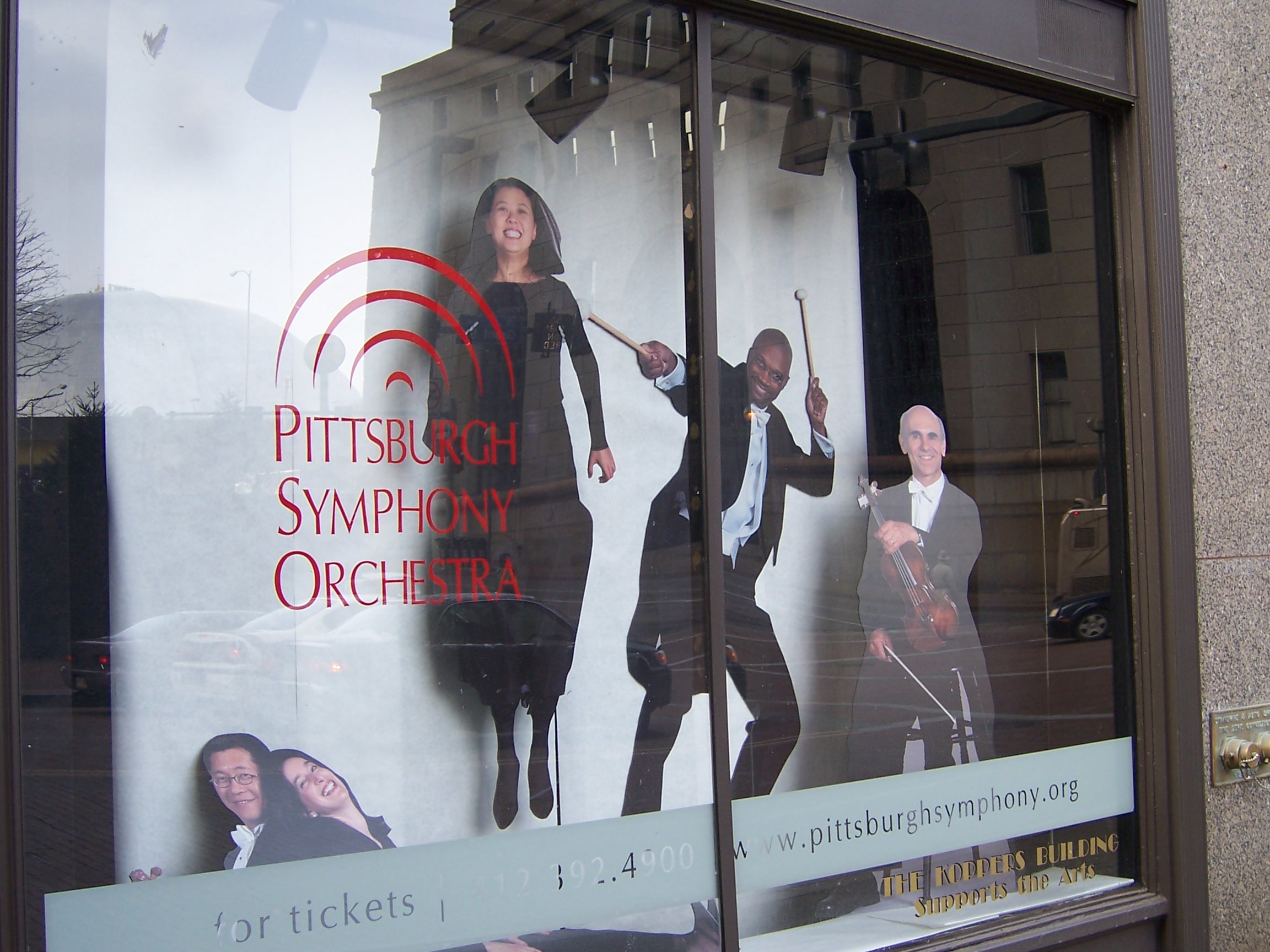
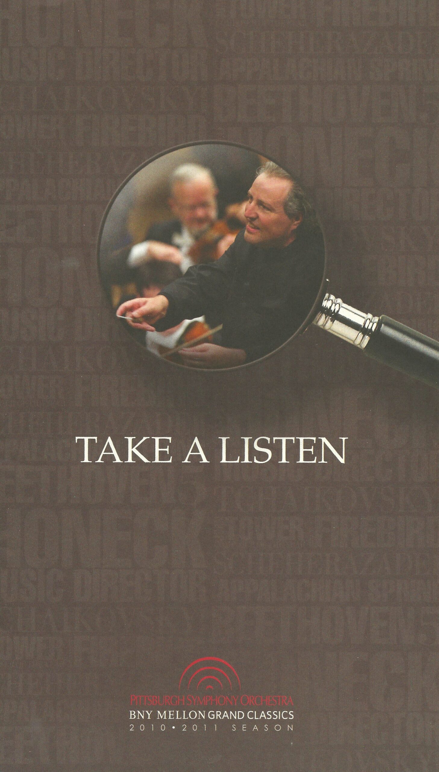
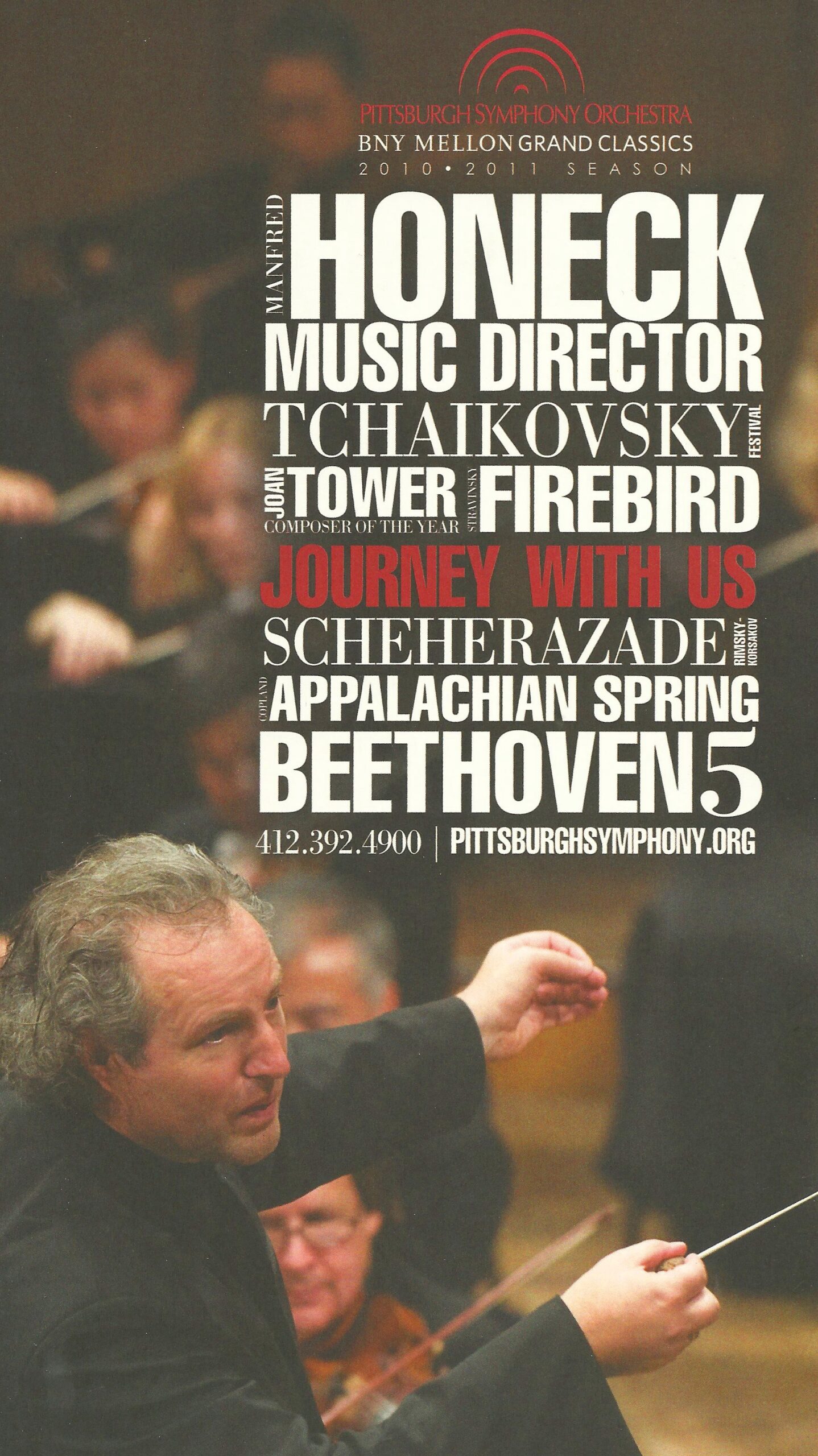
At the time, the logo was a serifed type-treatment, but a former logo had been created in the ’70s and revered by the organization. It was created with historic Heinz Hall in mind as its arches mimicked the building’s architectural cupolas.
It was decided to revive that old logo but with a modern facelift. Deb modified the former (heavy) arches graphic to a slimmer and sleeker design style, updated the typography, and creating versions for various uses.
The new iteration came to mean much more and began to represent the formation of the orchestra and the Doppler effect of big sound. The red color made perfect sense in color theory for the romance and drama of classical music. It also seemed perfectly in tune with the red carpeting through Heinz Hall’s interior. And, well, Heinz Ketchup, born in Pittsburgh.
A bold new era...
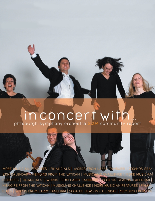
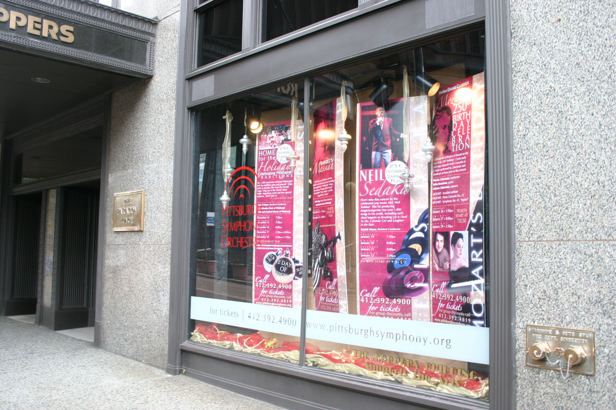
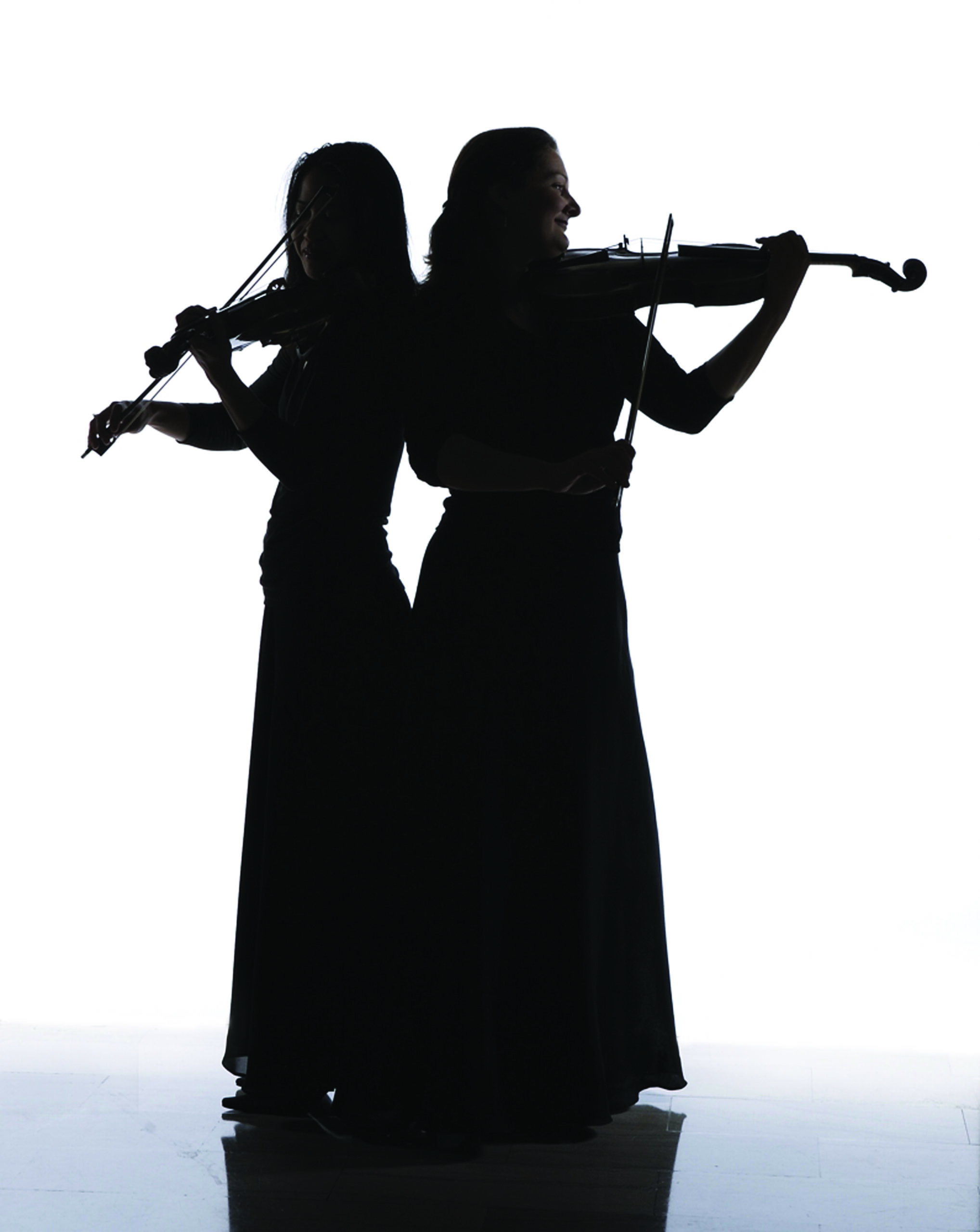
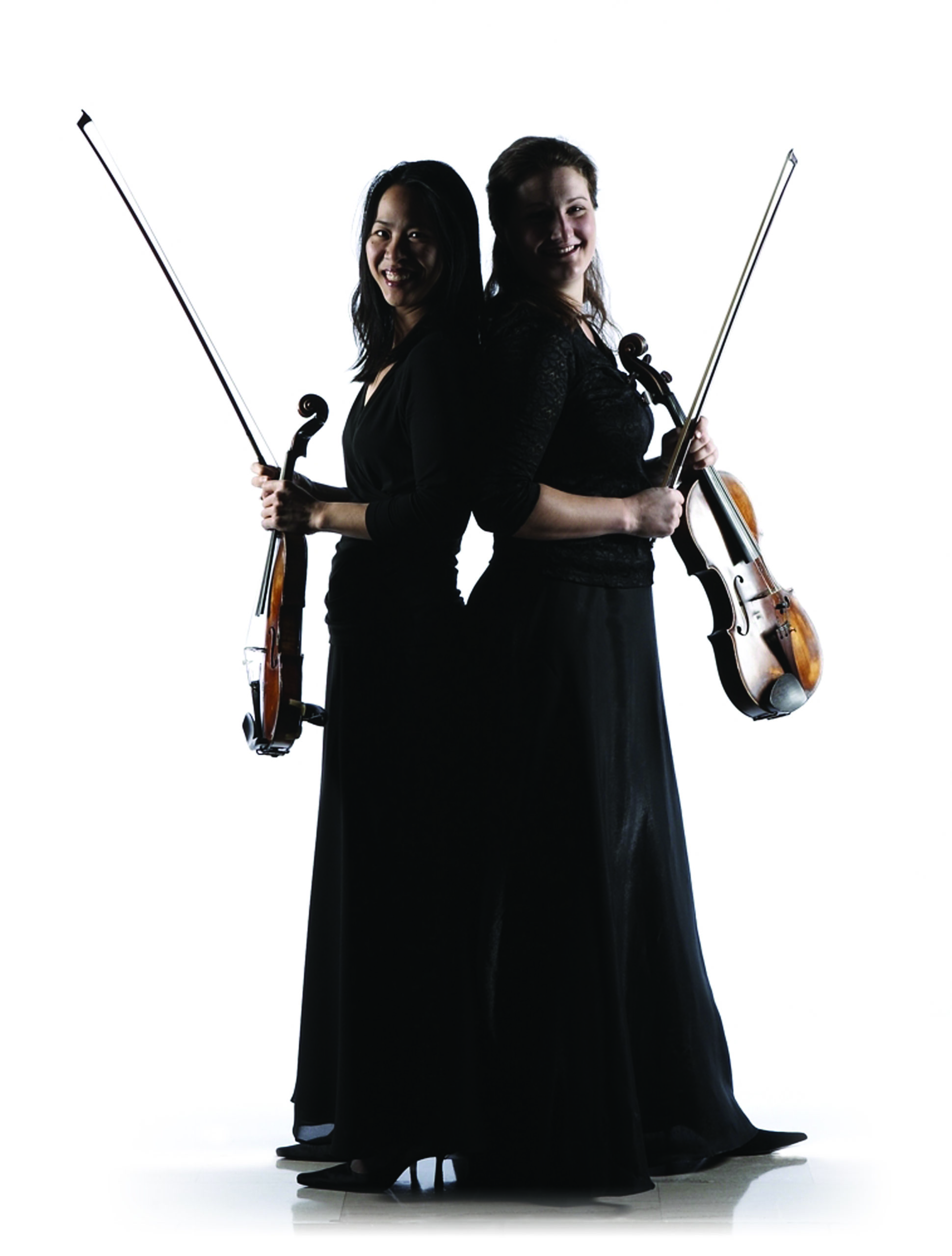
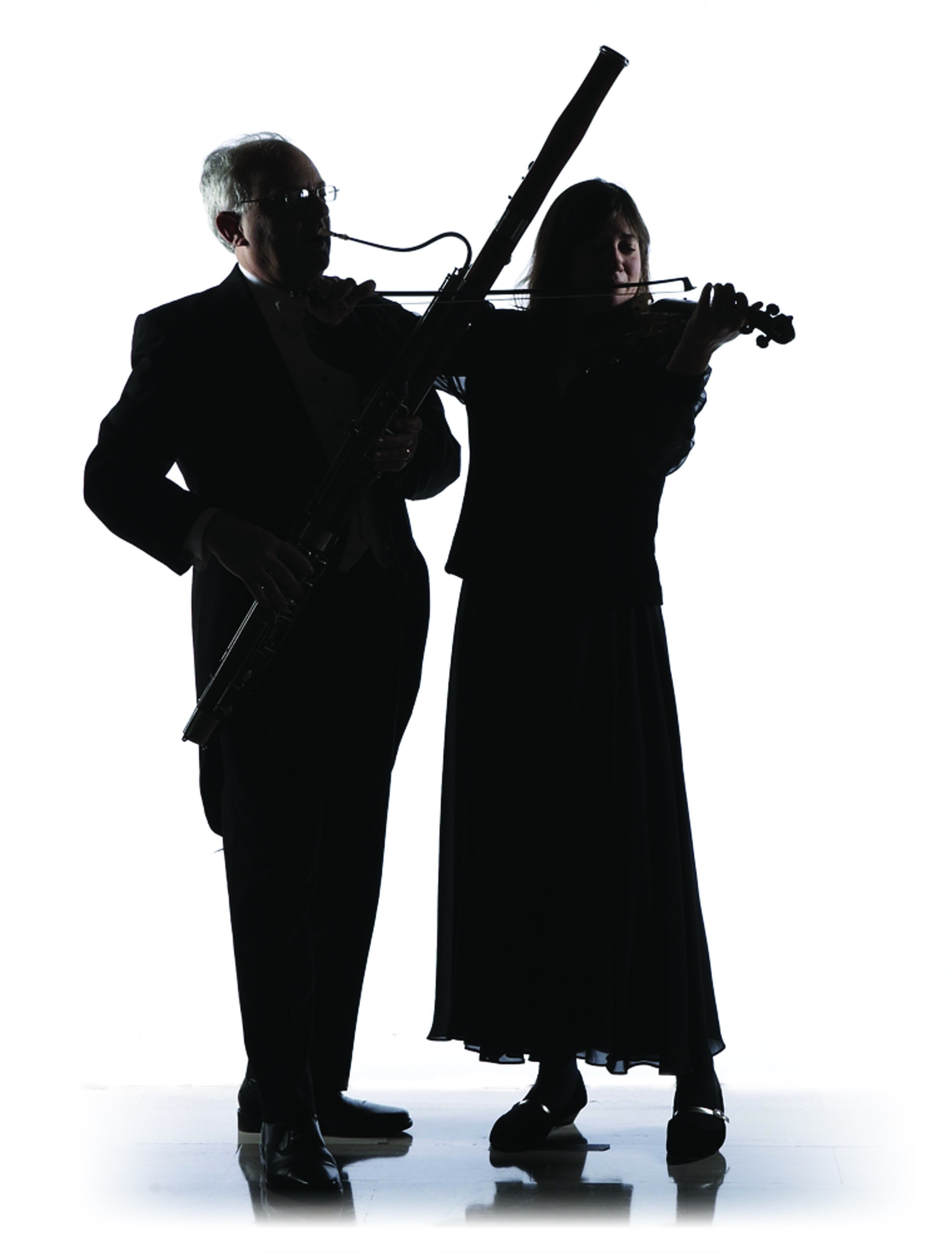
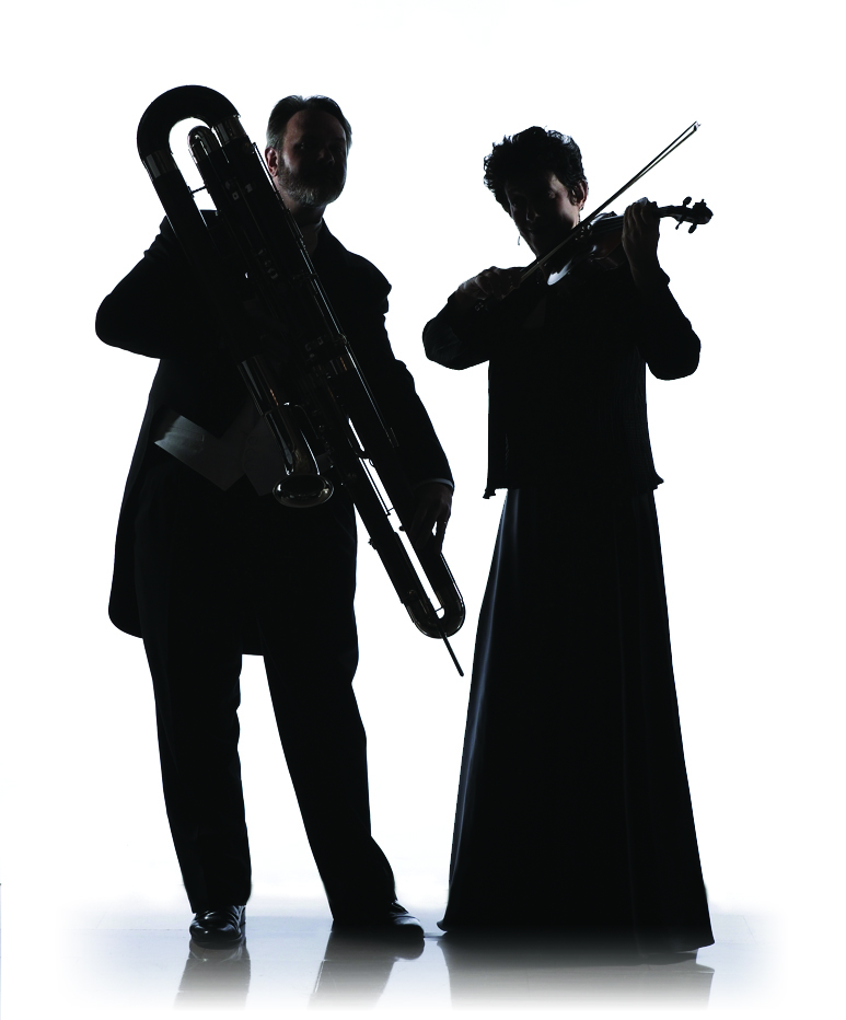
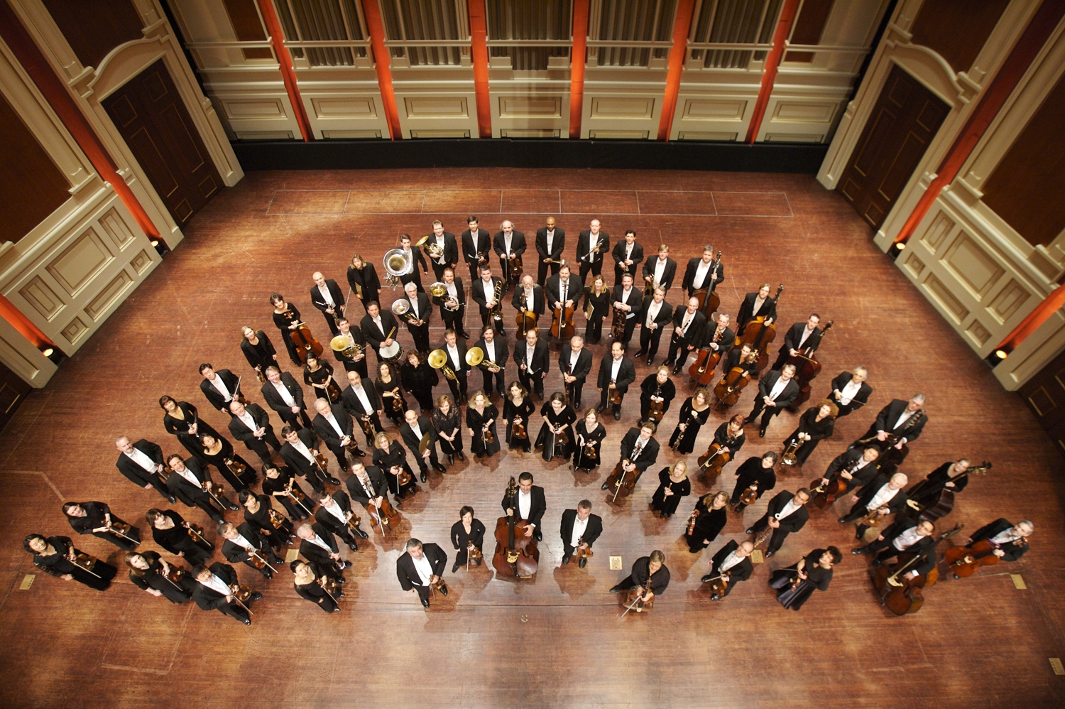
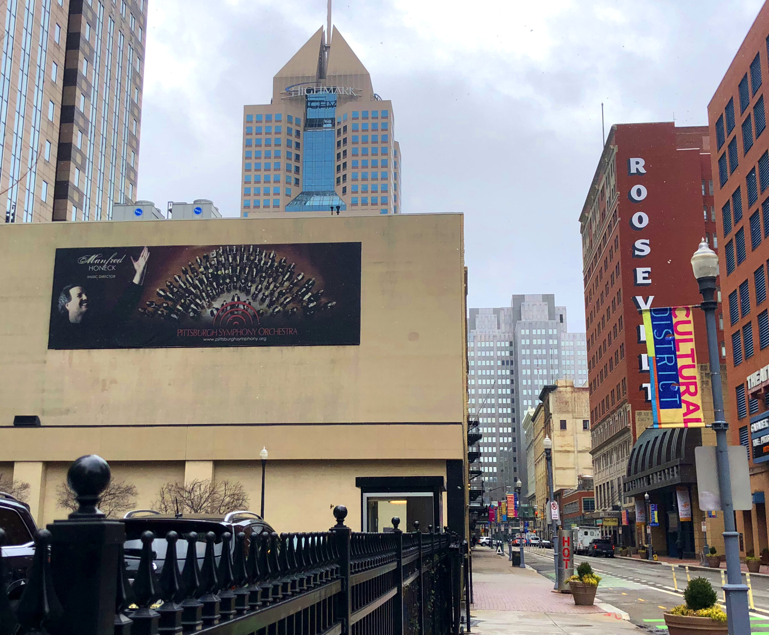
That new (but also old and strong) foundation, were the beginnings of some exciting projects: UNIQUE* photo shoots became an annual occurrence, window displays were placed around the city, cardboard stand-ups were created of the musicians, banners adorned light posts in the front of Heinz Hall, and an award-winning annual report was designed featuring the musicians as your interesting neighbors in Pittsburgh.
*Ask me about these photoshoots! They are some of my most proud Art Direction moments.
The work was only just beginning, but with the proper framework in place, we began the creation of brand ideals, the refinement of the organization’s vision, the creation of internal systems, the redevelopment of the website, and so much more… Some of that work still continues today, as DesignQuack assists them in the creation of their annual subscription marketing materials.