Client :
Kidsburgh
Project :
Logo System
Date :
March 2016
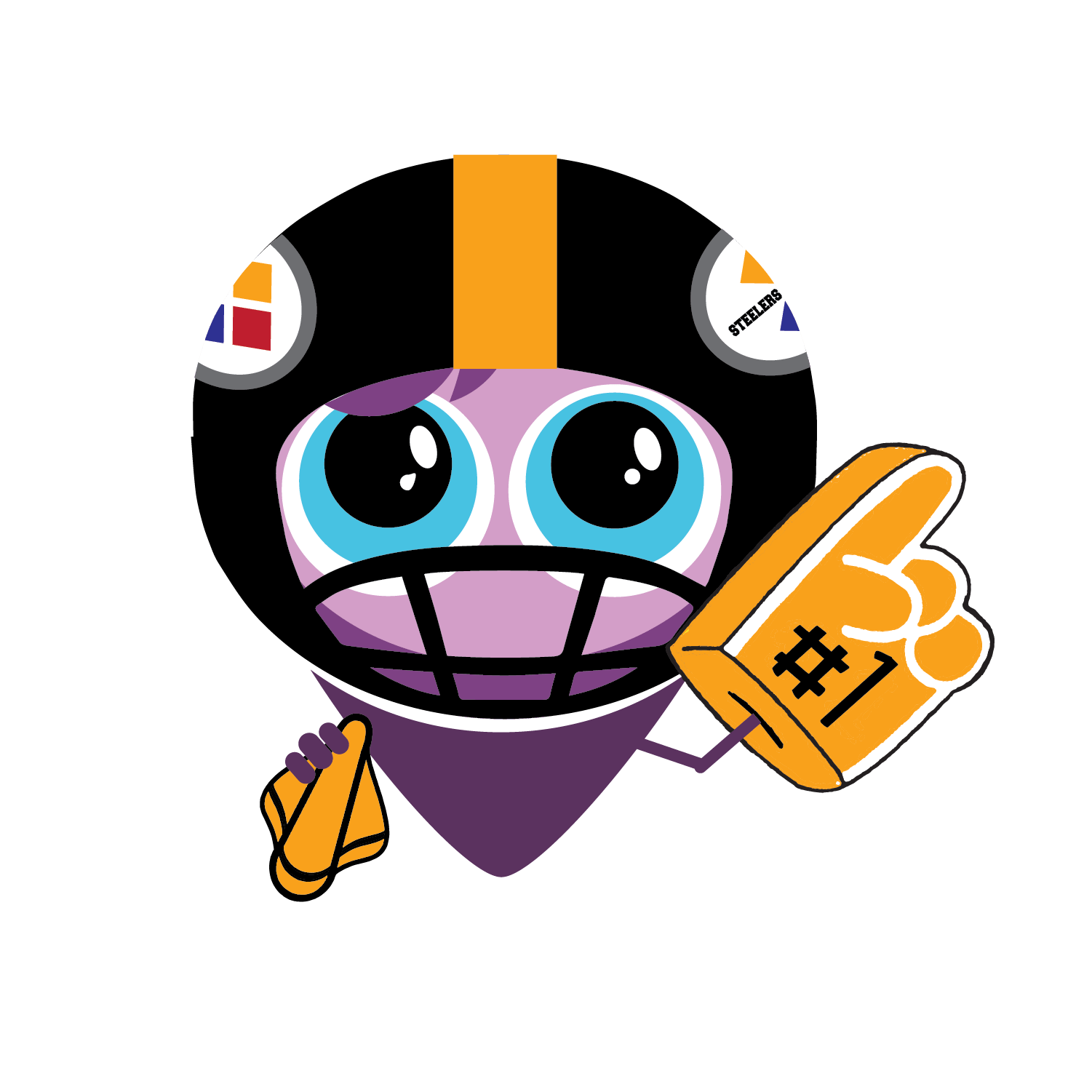
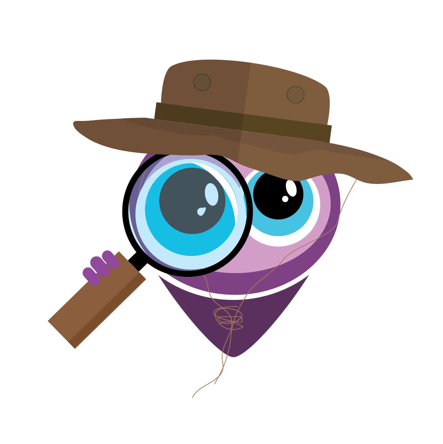
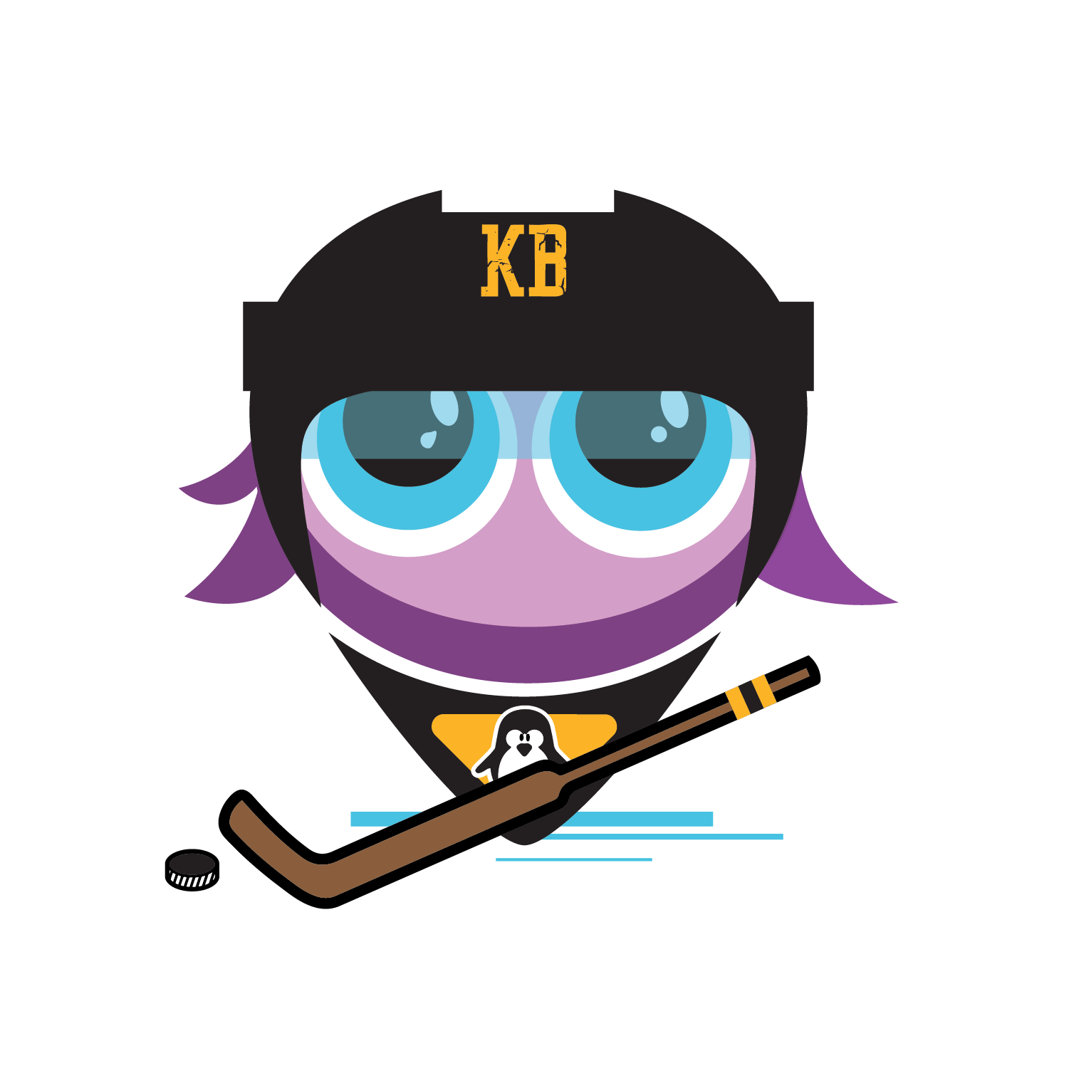
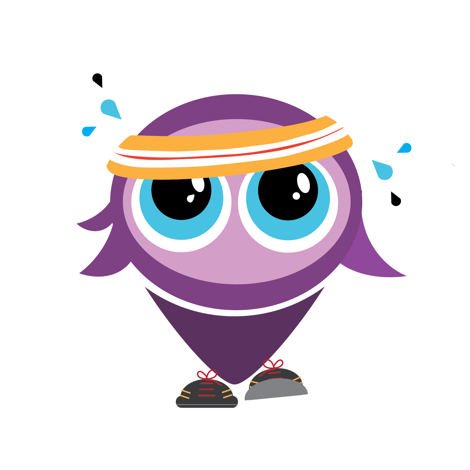
We re-branded Kidsburgh.org in 2014 with a mascot named “KB” in the shape of a map pin, and since then, the logo has taken on a life of its own! The possibilities for this playful icon are endless!
The map pin icon has since become a trendy symbol and used often. But, for Kidsburgh, it means that “You are here.”
Since its initial launch, we’ve evolved him into a runner, an explorer, a chef, a sports fan, a toddler… We’ve used him for special occasions, and maybe someday, he’ll be a lifesize character. #maybenot #topheavy
